Our Services
case studiesPotent visibility and growth strategies at work
A snapshot of Proctor Digital’s powerful suite of digital marketing strategies in action
CLEF NOTES PUBLISHING, INC.
In 2010, Clef Notes Publishing, Inc. came to Proctor Digital with a distinct need for visibility in the crowded publishing marketplace in Chicago. While the publication was the only one whose sole focus was arts and culture, it was among several that competed for the eyes of upscale consumers in the Chicago metropolitan area. Similarly, the brand needed to get the sustained attention of advertisers catering to this audience.
Email Marketing: The difficulty the company had experienced lie in its publishing cycle. It was a quarterly publication competing with other more well-known publications in the city with a monthly frequency. Advertisers who had been presented with the magazine and its advertising products months earlier had to at times be reminded of the publication’s market, audience, beat and advertising products. Essential, the magazine needed brand recognition and visibility in order to even begin getting market share.
Proctor Digital developed a visibility strategy that helped the brand get in front of advertisers on a weekly basis via targeted email marketing, promoting the magazine’s content and advertising products. The vehicle helped us get access to arts and culture readers as well as advertisers interested in reaching them with a much greater frequency than its print publication allowed.
SEO Management: In order to help build the subscriber list for the email marketing campaign, we embarked on a robust SEO management strategy designed to draw targeted traffic back to the magazine’s early website. That campaign included a slight redesign of the website to ensure a more user-friendly path for readers to find articles, subscriber services and more, designed to convert visitors. It also included targeted editorial mandates designed to encourage link-building from local arts and culture institutions in the city. These links were pivotal in driving the website up the ranks for searches like “Chicago+Art” and “Chicago+Arts+and+Culture.” The addition of email signup forms to subscribe to the magazine’s new e-zine were essential to growing the publication’s list from just under 300 to more than 20K in a matter of 6 months.
Ultimately, our email marketing and SEO campaign drove visibility for the publication and conversion to the tune of a 430% increase in subscribers and a 274% increase in advertising revenue over the course of our first year servicing the firm. Since, the magazine’s revenue and subscribership has grown exponentially.
Brand Development/Re-Branding: In 2019, Clef Notes Journal expressed an interest in re-branding the publication to expand its perceived audience and update its website and marketing collateral. We began with a full re-design of the magazine’s original logo, incorporating the iconic musical note that was a part of the logo the firm’s team designed at its launch in 2008. The new logo was designed to be bolder, with an emphasis on intent and incorporated the iconic musical note using negative space so that, while still maintaining prominence in the image, it was formed by the outline of one of the logo’s components as opposed to functioning as a component itself. This new branding strategy was flowed through to all of the magazine’s online profiles and marketing collateral, including a re-design of its website.

Web Design: Also in 2019, and a part of the magazine’s re-brand, we designed a new, modern, more immersive magazine website that, unlike the original site, incorporated a robust article search function (based on categories and subject tags), was sectioned based on the magazine’s beat categories and incorporated a site-wide advertising display that was easy-to-maintain and update and increased the magazine’s ability to monetize its content for advertisers across the board.
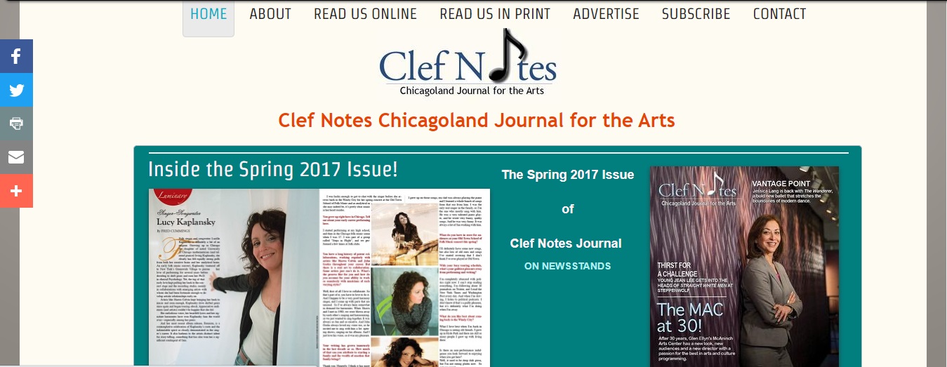
Original Design
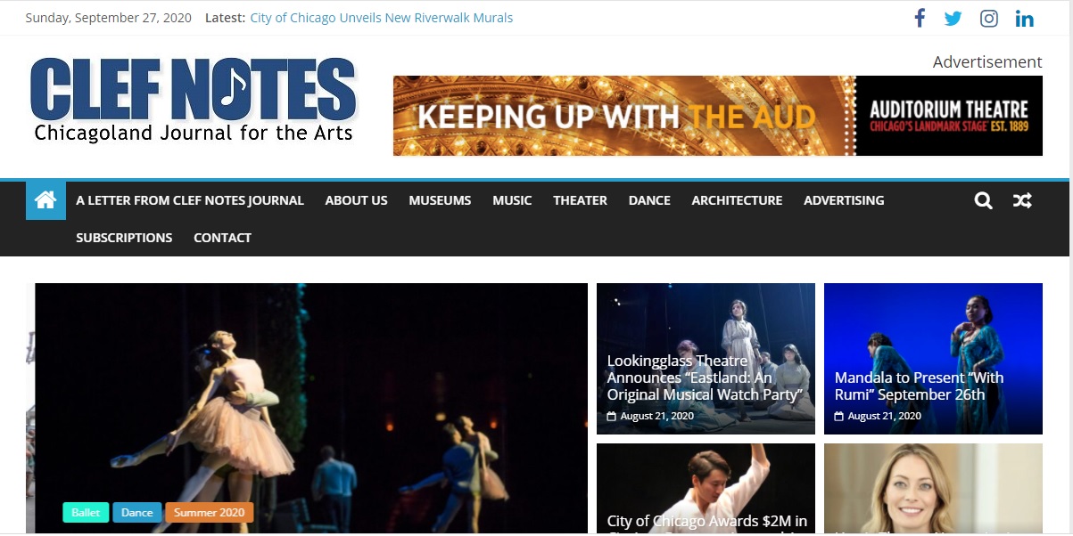
Proctor Digital Re-design
We also re-designed the firm’s weekly email campaign consistent with the new branding and strategy.
The result is a sharp, modern brand that offers greater connectivity to its audience, engendering greater brand loyalty and a broader, more flexible advertising platform for monetization.
FORCE HOME RENOVATIONS
SEO Management: Park Ridge home remodeling business Force Home Renovations came to us with a need for increased targeted web traffic for their website. The site was not ranked for any of its core services in local area searches. The client requested an SEO strategy that incorporated a local SEO pack that would include not only their home office of Park Ridge, but also several neighboring villages in Chicago’s northern suburbs. We developed a robust strategy that relied on technical factors isolating their core services, including popular services like deck, kitchen and bath remodeling. We expanded the use of keyword targeting on the website beyond the broader search term of “home remodeling.” We applied this strategy to the site and designed additional landing pages to target searches in 5 suburbs specified by the client. Within three months, the client website was ranked on page 1 of industry searches of Park Ridge, and within the first two pages of searches for the 5 targeted suburbs requested. The campaign resulted in an increase of 270% in targeted traffic for the website. The strategy continues to return improved rankings for the 5 suburban locations, as well as strengthened core ranking in the firm’s chief location of Park Ridge, capturing one of the three coveted Google maps positions for the area.
ILLINOIS ASSOCIATION OF MEDICAID HEALTH PLANS
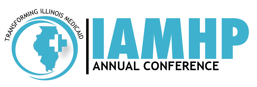
LOGO/BRANDING DESIGN: The Illinois Association of Medicaid Health Plans commissioned us to develop a new and vibrant logo for their annual conference of Medicaid health plans in the state focusing in trends and developments in Medicaid. The Association wanted a logo that was fresh, yet harkened nicely to their existing brand. We designed a combination letter mark and brand mark (pictorial) that showcased the movement of Medicaid trends in the state as well as the visual cues endemic of Illinois Healthcare. The result is a dynamic visual brand mark that underscores the brand’s authority in the space and forward-thinking reputation the association enjoys.
ILLINOIS POWER ASSOCIATION
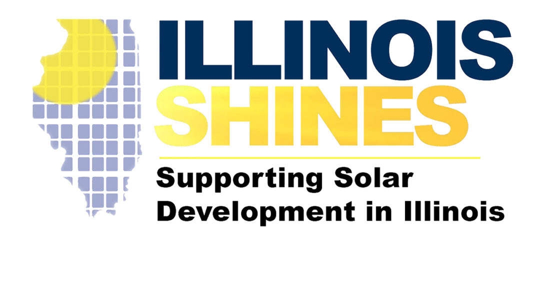
LOGO/BRANDING DESIGN:
CHATFIELD CLARKE
West Coast-based Chatfield Clarke came to us with a request to redesign their website to add a sleek, modern look with catalogue style showcase functionality. The company wanted a way customers could browse their product lines and create an online shopping cart styled Request for Quote tally along the way. The website had to showcase their proprietary color swatch line with an option for architects and designers to get an up-close-and-personal view of swatch colors and textures. We developed a showcase website with an e-commerce infrastructure that afforded the best of both worlds. We also added an account functionality so that returning customers could register their accounts and maintain a record of their prior quotes.
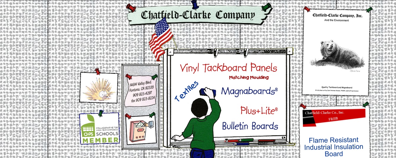
Original Website
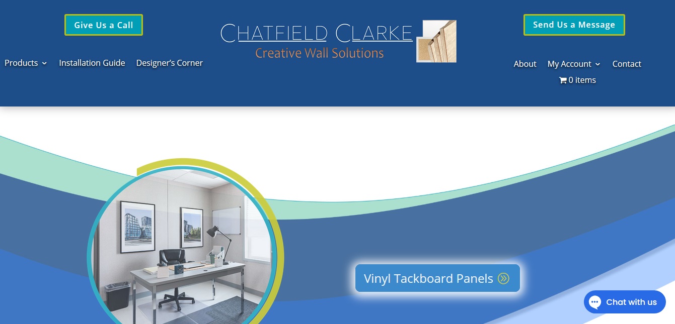
Proctor Digital Re-design
The result was a warm, modern rebrand that enabled optimal user-experience and a much easier quote request option.
SKI INVESTIGATIONS
Miami-based investigations agency SKI Investigations reached out to Proctor Digital to redesign their website. They wanted to move away from the dated feel of the original site to present a more modern, up-to-date online presence commensurate with the modern, technologically superior brand presence they wanted to present for their agency. We took the core elements of their website’s offerings: services, locations served, team and technology descriptions and updated them with a sleek, stylish design, an easy-to-navigate layout and responsive functionality that allowed ease of use irrespective of the device used to browse the site.
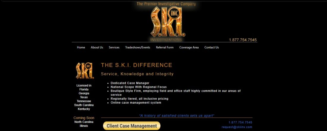
Original Website

Proctor Digital Re-design
The overhaul created a much more visually attractive website for the brand that spoke to the modern, advanced capabilities for which the agency is known.
Clients
Serving Key Brands Emanating from A Wide Variety of Industries


Contact Us
222 Merchandise Mart Plaza,
# 3994
Chicago, IL 60654
Tel. 773.664.5819
Email: Info@ProctorDigital.com
